Thursday, 13 June 2013

Alpha/Dictionary Challenge: Urban Magpie!

Once again I've had lots of fun playing along with the Craft Barn's Alpha Dictionary Challenge, which this week focuses on the letter U. If you click here you can discover all about this wonderful opportunity to explore words and create at the same time.  I started off a new art journal this week and my first page is my Alpha Dictionary Challenge - U for Urban. I wanted to express how urban can be beautiful, exciting, lonely and troubling all at the same time! I used Paper Artsy Fresco paints in Mermaid, Beach Hut, Blood Orange and Pumpkin for my background and a letter stencil to write my word. If you would like to see in more detail, simply click on the images.
The image of a girl looking up at the sky is a gel transfer from a photo of a friend taken by my daughter. I tried to create the impression of peeling layers like the peeling posters one sees in all cities and which I find intriguing - like a palimpsest of city life: ah, there's a word for letter P!!!
My dictionary definition is in a book-plate from a Tim Holtz die, decorated with Grunge Paste through a 'chicken wire' Crafters' Workshop stencil and painted with Treasure Gold - White Fire. I stuck  little embossed butterflies, embellished with gems on my page to create the idea of either flight or that nature is always trying to break out in the city. I stamped on a Vaporetto ticket from Venice from Stampington's 'Butterfly Girl' and Lynne Perrella images of cities.
I added Paper Artsy images and a distressed tag attached to the corner of the page with an eyelet and a gem. My secret journal message 'At the heart of the city something stirs' is on the back of this!
Here is another of my embellished butterflies, stamped from a Paper Artsy image once on the page and then again on painted card, embossed with mixtures of Verdi Gris; black and gold and sparkle, embellished and added to give a 3D effect/

The images of faces are from a Tim Holtz 'Stampers Anonymous' plate and I added these to give the impression of the glimpses of faces in the city crowd. Just above the building is a punched out stamp with the words, 'Wings to Fly' embossed in silver, from a Paper Artsy 'Ink and the Dog' set. Thank you for stopping by Magpieheaven for my third Dictionary Challenge. Have a lovely, creative day. I'm off to enjoy the other creative gems of the Alpha Dictioneers - if that's a word!


Friday, 7 June 2013

A Happy Birthday Challenge

This week Sue Carrington has been crafting some stunning creations over at Paper Artsy click here to see; at Country View Crafts  the new challenge is to use die cuts in an inventive way and I needed to make a card for my great aunt, Violet who will be ninety-six soon! Could I combine two challenges and a very special birthday card?
Well, Sue's first two projects had a sewing theme and Aunty Violet trained as a tailor many years ago in the East End of London. She sewed beautiful clothes for herself and all her family for many years so the sewing theme seemed really appropriate for her card. I have the Tim Holtz die of the dress-form so it just remained to get creative with Sue's and Country View Crafts' inspiration and my die cuts!
I was inspired by Sue's 'Sewing Room' idea so I made an A4 gatefold card from heavy white card as my base, before cutting out and painting some panels to attach to it in beautiful blue Fresco shades similar to those used on Sue's sewing box.
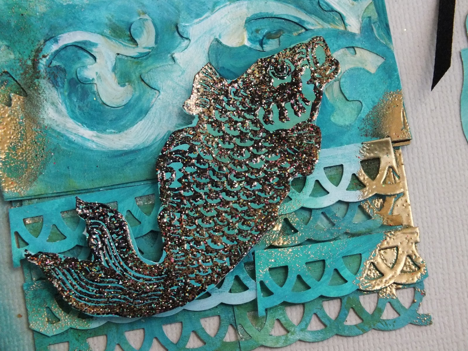
I die cut a Spell-binder die of a label and a keyhole within to create a fancy lock and a spell-binder frame in card and painted them with Little Black Dress and put them aside to allow them to dry so I could crackle glaze them.
With a die-cutter you can cut several sheets at once so I die cut the Tim Holtz dress-form in both card, which I painted with Beach Hut Fresco, and Graphic 45 paper which had a shabby chic look to it. I finally stuck these together with a little of the BH showing around the edge to give dimension. I also used a Tim Holtz 'On the Edge' die of scissors and spools. Here it is in the first stage of my painting it with Frescos and Metallic Glaze for the Blades. I later added a strip of blue, chiffon ribbon and some Treasure Gold for a vintage, shabby chic effect.
I also used a Tim Holtz bookplate from his tag die to make the name plate on my door. I didn't have a stamp with the words 'Sewing Room' printed on it, so I wrote my own with a Sharpie black pen. I painted my keyhole with Fresco Vintage Lace when the thin layer of crackle was completely dry.
So here is the outside of my card. I attached my panels, decorating them with Treasure Gold through a stencil. Sue had used a ruler stencil, but I used a Crafters' Workshop flower stencil. I hope this looks a little like gold lace. Tim Holtz's dress-form comes with dies of a cotton reel and a button and I cut many layers of card so I could have a supply of button and reel embellishments, which I embossed with Verdi-gris and black sparkle embossing powder, using a Paper Artsy 'Ink and the Dog' stamp of tiny buttons so as to create a big button with a design of lots of sparkly, tiny buttons on it! I also stamped 'thimble' from this same plate on one of the cotton reels coloured with Peacock Feathers distressing ink. If you look you can see other die-cut buttons and reels made from Graphic 45 and Bo Bunny papers. To see more clearly, please just click on the photo. The one on the left has a design of dress-forms on it. I edged the outside of the card with Treasure Gold and a strip of Dresden foil trim. The finishing touch to my 'double doors' is a blue chiffon ribbon tie from my favourite market stall, Dennis' haberdashery!
Here is the card opened out. To create a more interesting background I used one of the Tim Holtz buttons as a mask and stamped over my Fresco painty background, using Peacock Feathers DI to create a kind of shadow stamped effect of buttons. I coloured some seam binder with Broken China and Peacock Feathers and attached the ribbons to two of the card buttons painted with Bora Bora Fresco.
Here is a closer look at the embossing, a touch of Treasure Gold and crackle around the mirror and the effect of the Beach Hut just showing behind the top dress-form.
I was really pleased with the way the crackle turned out on my lock; I adore Paper Artsy Crackle Glaze. I dabbed a little, diluted translucent South Pacific around the edges and just a touch of Treasure Gold.
So Happy Birthday, Auntie Violet! I should like to enter this card for Paper Artsy Draw and for the Country View Crafts Challenge. Thank you so much for having a look inside Magpie Heaven today and welcome to my new follower, Lucy.

Wednesday, 5 June 2013

Back Home for WOYWW!

Hello anyone who has stopped by for this WOYWW. Thank you Julia at The Stamping  Ground http://stamping-ground.blogspot.co.uk/for hosting this great blog hop, which gives us the opportunity to 'catch up' and spy what other crafters have on their work benches on a Wednesday! I was away last week and missed all the 4th anniversary fun and games. I hope you all had a great time and that the crop went well. Thank you for the lovely ATCs that people kindly swapped with me; I've never had such exciting post! I feel like I've made so many lovely friends since I started blogging back in April and WOYWW has really helped. Just lately, now the weather is warmer, I've been working in our little conservatory, that our friend Kevin built onto the side of Magpie Heaven. It's freezing in the winter and a bit like an oven in summer, but it is lovely and light.
As you can see I've got my Big Shot out and I'm planning to have a good old play with this today. I am hoping that I might get some inspiration and eventually produce something I can enter for the Country View Crafts Challenge. This die of little houses was one of the first dies I ever bought and I still love it for its adaptability. The fabric is some I bought from the market and made some cushions from. I love it because in some lights it looks grey and in some it looks pink. I used it as a backdrop for a recent 'make' for Darcy's ARC. I was really excited because this piece appeared in Altered Arts Facebook Magazine. If you have time you might like to take a look at it on my blog post http://magpieheaven.blogspot.com/2013/06/magpies-second-artful-reading-review.html. 
As you can see, mybright orange scissors are clearly visible at the moment; but for how long? Do they have magpie wings and fly away because they will undoubtedly disappear by the end of today! I put my ATCs on a notice board in our bedroom, but I've brought them down to have around while I work to remind me of those fellow crafters near and far crafting away with me. I wish we could all get together and have some inky and painty fun under the same roof; but the next best thing is WOYWW so I'm off to take a look at what everyone else is up to right now! OOh yes, and I am going to do a kind of gallery post of my ATCs with who sent what next week. Thanks again all!


Tuesday, 4 June 2013

Another Alpha Dictionary Challenge

I loved the last Alpha-Dictionary Challenge, not just participating, but also seeing all the other fantastic entries, so I decided to join in again and here is my entry for http://thecraftbarnblog.blogspot.co.uk/2013/05/alphadictionary-challenge-letter-f.html.
I hadn't done much in my journal so instead of a tag this time, I went for a journal spread: the word I chose was 'Fibre'. I explored the idea of fibre in textiles, rather than the vegetable fibre that is supposed to keep us healthy!
As I worked on my page, I thought more and more about fibres, texture and textiles. I painted my background with Fresco Paints: Bora Bora, London Bus, Mermaid, Beach Hut, Hyde Park and Ice Blue and tried to give the impression of different draperies and the fibres that go to make them up. The moths' and butterflies' wings reminded me of the fragile fibres that make the most beautiful materials.
 I used Lynne Perrella stamps from Paper Artsy that incorporated textile fibres into their design stamped onto tissue and painted on the reverse side. I combined actual yarn fibres with my painted and stamped images and then stencilled with a Crafters' Workshop stencil and Ice Blue Fresco to give a lacy mesh look.
I used gems and dimensional paint to embellish along with Treasure Gold, some embossing (luckily I didn't burn the page which is always a possibility!) and my own calligraphy.
I am always reminded of Russian icon painting when I use LP stamps and last Friday I was lucky enough to see an actual icon painter working on her exquisite backgrounds at the Vand A Museum's Russian evening. It was fascinating to see her working with gold leaf and ground semi-precious minerals. Well, Treasure Gold may not be real gold leaf, but I still love using it.
Here is a close-up of my dictionary definition of fibre. The gold, the gems and the bright sunshine made it difficult to photograph these pages, but if you click on the images you can get a clearer impression. Thank you for taking the time to look at my interpretation of 'Fibre'. I can't wait to explore the other entries for fe-fr now! 


Monday, 3 June 2013

Magpie's Second Artful Reading Review

Happy Monday, anyone dropping by and welcome to my second book review for Darcy's amazing ARC http://art-and-sole.blogspot.co.uk/2013/05/arc-may.html.  I chose Steven Amsterdam's 'What the Family Needed', which I discovered through my local independent bookshop's website. I did put it on my book-shelf gadget, but when I added others it vanished due to my rubbish technological skills! Well, this novel was not a perfect one, but I did enjoy it tremendously. Amsterdam writes with humour and something sometimes underrated - kindness! You feel that he actually likes his characters and that he has affection for the human race in general!
The novel begins with a visit. Giordana and her mother and brother, Ben have turned up at their aunt and uncle's house. Giordana's mum is going to divorce her dad and the family is about to change forever. Nothing special about that, you might say, but Alex, Giordana's little cousin in his Superhero suit starts by asking Giordana what she would wish for if she could choose and then things just 'take off'. The novel spans thirty years with each member of the family discovering they can do something extraordinary courtesy of Alex, although they don't know this. We are shown the effect this has on them and surprisingly this provides some quite profound insights into human nature. How it feels to be invisible; to be able to hear other's thoughts or to swim faster and further than you ever dreamed or to make people fall in love are explored with wit and tenderness. Poignantly Alex, who has this amazing gift to grant wishes develops from quirky little boy into troubled teenager then lonely adult and finally returns to the warmth of his family . Ben's discovery that he can fly, taking his baby son on flights, along with Alex's dad who discovers that he can change anything that has happened except the death of his beloved wife are the most memorable and moving moments in this very original and enjoyable novel. I really wanted to find out how each family member used his or her gift. However, the flaw in the novel was that, in the way of fairy tales, no explanation was ever given of how or why Alex had this amazing gift to bestow on his family even though they never truly understood him; or maybe this was the novel's message, that we can easily overlook family members' hidden talents.
I really wanted to illustrate this novel in 3D again. There is a bar in the novel called 'The Lion and the Witch' and customers enter it through a wardrobe. I wanted to create an enchanted wardrobe featuring some of the characters. If you click on the images you can see in a little more detail.
The starting point was just a flat doodle of all the interconnected stories. I then scanned this into my computer and reduced it so that it would fit into one of Retro Cafe Art's box shrines, designed to hold ATCS. I hand-coloured the background using Paper Artsy Fresco paints. Up above the enchanted 'wardrobe' is a tiny mini-shrine from RCA which represents home and family, the heart of the novel.
Here is a closer view of the 'wardrobe'. I tried to make the interior seem like a garden opening into a world of possibilities for the characters. The sun and the moon represent the passing of time as the novel progresses. The house stands on tiny 'ivory' dice legs on a chipboard base painted with Treasure Gold to suggest the playfulness of the novel.
Although Ben doesn't literally have wings, I felt they were needed to show he could fly. I showed him at the point in the novel when he wants to show his incredulous young wife that he does have the power of flight and leaps out of their apartment window; I thought the little figure again from RCA did look like he was poised for flight if you placed him on the edge. The house is on a little chipboard island I made painted with Treasure Gold.

I painted the sides of the house with Treasure Gold, after I had used the marvellous Paper Artsy Grunge Paste through a stencil to give the impression the 'wardrobe' had carved sides. The little figures at the top are swimmers resting after a strenuous few circuits of the lake, as Natalie, an ordinary wife and mother receives the gift of extraordinary swimming ability and the sense of control and freedom this gives her is exhilarating.
Here is a view of the back, Grunge pasted  through a 'Crafters' Workshop' stencil with a stamp by Sandra Evertson from her 'Petite Whimsies' collection. He is a little clockman juggling with stars and this reminded me of Alex granting wishes for the family as they lived out their lives.
I just loved exploring the ideas of this novel through art. Thanks Darcy for giving us this opportunity to create and share. Now I'm off to have a peek at what other readers and creative artists have been interpreting.


Saturday, 1 June 2013

A Magpie Keepsake

 Well, here I am back home to glorious sunshine after a very wet time in Stratford on Avon - typical! The old magpie feathers certainly got water-logged, but Stratford was magical and Anne Hathaway's garden in the rain was actually quite heavenly. Hello to my crafting friends who I really missed while I was away and 'Hello' to my new follower, Felicie. There is always so much to do when you return from a holiday with all the piles of washing and sorting out that just seem to multiply as you look. My answer was to feast my eyes on the Paper Artsy blog http://blog.paperartsy.co.uk/ instead. And what incredible projects Darcy had created, so full of intricate detail. I would love to have a go at one of those wonderful bags (one day...), but  I only had time for a small project because all that washing was not going to do itself! I decided to play with the idea of faces and to create a pair of Elizabethans - Orlando and Rosalind from 'As you Like it' inspired by one of the amazing Stratford productions. So here is a little Elizabethan keepsake. I started out by die-cutting two oval shapes from muslin type material and letting my imagination loose creating two Elizabethan faces drawn with a permanent marker and heat-set and painted with Frescos. I made a background from the same fabric painted with Fresco paints in Bora Bora, Beach Hut and streaked with London Bus I then stamped on this with Archival ink on some leaves and stencilled with Treasure Gold in a Crafters' Workshop Harlequin stencil. I managed to borrow my daughter's sewing machine to edge the fabric. Here is what the book-cover looked like to begin with.

I made a fabric rose from a Tim Holtz die painted with Rose Fresco and Snowflake and edged with Treasure Gold and stitched it on. The ruffs I hand stitched on are from an old lace top of my daughter's and I coloured a little of this to make a garland for Rosalind's hair; I decided Orlando looked a little too much like a painted egg so I made him a hat decorated with some Lynne Perrella shells. The decorative script is stamped in Archival from a 'Hot Picks' plate. Here is a close-up of it.
 I decided to give Orlando an earring from a wire with a gem on it and attached a shrink plastic charm of a Lynne Perrella stamp painted with glossy accents and alcohol inks with a jump ring.

I still felt the cover needed something extra so I added some gems and a bright blue feather. I wrote the title 'Rambles' on a fabric label which I edged with some ribbon and accented with some metallic dimensional glue. I glued my cover onto one of Paper Artsy's hard-backed notebooks. 
Here is a view of the back with the same Hot Picks flowers that Darcy used on her bag stamped on to a background painted with Bora Bora, Guacamole and a smidge of London Bus. 
I liked the way the patterns continued over the spine of the notebook.
So 'Thank you, Darcy' for a truly inspirational 3 projects. I'm off to take a look at what other people have been creating - and then do the washing, of course. I've so missed having a good old nose at all your lovely 'makes'!


Saturday, 25 May 2013

An Oriental Magpie

I seem to say this every week, but not only did I play along with the Paper Artsy challenge this week when I thought I really wouldn't be able to, I was so inspired by Carol's projects, I played along twice!!! I thought the tag she created from Lynn Perrella's Asian collection was stunning. Please do look over at http://blog.paperartsy.co.uk/ . Here we are then, here is my guilty pleasure, another entry for the Paper Artsy Challenge! I have some of the Asian stamps, although not the same plate as this one was taken from. I haven't yet seen anyone interpret these images so I was keen to have a go. I love tags, but I can easily play away making them and then find I have loads that I don't know what to do with, so I decided to create a tag but incorporate it into a design for a card. Here is what I came up with.
I took some Smoothy card from Paper Artsy and sponged and dabbed at it with layers of Bora Bora, Mermaid, South Pacific and Limelight and I think there might be a bit of Hey Pesto in there too, possibly some Hyde Park - I got a bit carried away! I then swirled some very watered down Snowflake over the card to try to get a marbled effect. I used a Tim Holtz die to cut out my tag and - boo - I should have been more meticulous because the best marbling was left behind when the tag was cut out!! I so wanted to use this that I made it into a little tile, which I stamped with an LP border and added at the side of my card, accenting with some tiny green gems.
Years ago we had a shop nearby that sold those lovely little Chinese coins, but the proprietor retired and I used up my store so I covered a Tim Holtz die cut of a button with Treasure Gold and threaded through some black ribbon. I was really proud of my fish which I embossed onto some of the blue painted card. I used black glitter embossing powder and I love the way his scales sparkle in the sun - impossible to get the effect in a photo! Thanks so much, Carol for suggesting glittery fish and to stick them on with those little 3D spongy things!
I used a Tim Holtz swirly On the Edge die to suggest a wave and as my borders I improvised by using layers of punched out card. Talking about improvisation that brings us onto UTEE!!! I've never used this and it looked amazing on Carol's tag and on Sam's and Helen's! I had the idea that you always have to melt it in a pot and it's really technical and difficult to do. I must have been wrong and I'm now thinking of investing in some. Instead of this product, for now, I dabbed Versamark on the edge of my tag and embossed with ordinary gold embossing powder.
I then stamped my lady with Versafine Onyx Black and painted her with Frescos, Blood Orange, Snowflake and Vintage Lace with Hyde Park and Limelight. There are topaz coloured gems at the centre of the flowers.
I used some Core- dinations canvas effect backing paper, which I edged with Peacock Feathers Distress Ink. I embossed some characters in Detail Gold and added some seam binding distressed with Squeezed Lemonade and Peacock Feathers and Broken China. Inside the little frame is a detail of a Chinese lantern from some Graphic 45 paper.
Well, next week is half-term and I'm fluttering away to Stratford-on-Avon to catch some plays and be a tourist! How will I resist the temptation of grabbing strangers' lap-tops in cafes to catch up with what's going on in the land of Paper Artsy? Have a lovely weekend with - fingers crossed - glorious sunshine!