Sunday 29 June 2014

A Birthday Book!

Welcome to Magpieheaven where I've been very busy crafting a special birthday card for my mum. It's not so much a birthday card - more a birthday book, so apologies for another photo-full post! Over at 'A Vintage Journey' the challenge this fortnight is to 'Use Every Stamp in the Set'. For this little 'book' I used all the stamps on PaperArtsy's LPC 027 plus stamps from other sets too, so I should like to enter this for Challenge! Can you spot the image from LPC027 peeping around the corner of the front cover?
Apart from admiring Tim Holtz's Vintage style, I think that his crafting techniques and Lynne Perrella's stamp creations are a great combination. Inspired by Liesbeth Fidder when she was a GD at PaperArtsy a while back, I rediscovered those Tim techniques that had so bowled me over when I started crafting a couple of years ago. I love the effects that can be achieved using Tim Holtz's Distress Inks and his spritzing and misting techniques along with ordinary, thin household bleach - Liesbeth's suggestion. I always wonder about the history of these mysterious and characterful Lynne Perrella ladies and whether Lynne weaves stories around them as I do! This lady from LP027 looks like she might have quite a formidable wit to me: she certainly makes a strong focal image!  Another image from LP027 makes an appearance too: the boot filled with pens.
After folding a piece of A4 card into three equal sections in a concertina shape, I made my panels to go inside, using Distress Inks (Evergreen Bough, Broken China, Peacock Feathers and Bundled Sage)  swiped across my craft mat, spritzed and dried with a heat tool. I really love to look closely at the marbled effects that simply swiping card across misted Distress Inks achieves!Tim Holtz - you're a Genius! I stamped over them in Jet black Stazon before 'painting' highlights in Bleach.
I used the Flourish stencil from Prima with Wendy Vecchi Cobalt Archival for a subtle background touch.
I really enjoyed using the bleach on this one! To me it seemed to create the impression of eery moonlight! This figure always makes me think of one of Shakespeare's feisty heroines who dresses in boy's clothes like Rosalind or Viola.
In the background of this one, I used the bleach to create the impression of clouds billowing up behind the Kremlin! I edged my panels with some Frantage too - Shabby Blue and Aged Aqua. The lady peeping out below the focal image is from LP027 too so now I've used the whole set.
The next step was to fix my panels and add some embellishment. Inspired by Patty Sczymkowicz, I did some vegetable dyeing of lace, using Red Cabbage and Red Onions and added this to enhance the Vintage look.
Red Onions give a lovely warm reddish brown to lace and fabrics and the cabbage can create anything from palest lavender to deep purple.
Now for the cover! I decided this time to make a book-like cover. I used some die-cut card, painted with Tango and Yellow Submarine PaperArtsy Frescos and some circles made by dipping a lid into pools of Fresco paint. These little tiles cut from a Tim Holtz Trellis die were inspired by Lin Brown's technique, which she taught a few weeks ago in a Craft Barn class, the sentiment is from a PaperArtsy Hot Pick.
 There was one last embellishment to add now that the book was painted in shades of blue using Frescos in Antarctic, Beach Hut, Mermaid and Inky Pool...
folded and tied with seam binding; had a little Shrink Plastic heart with wings; some butterflies!
and Tando Creative chipboard pieces, painted, crackled and stamped...
I made two Shrink Plastic versions of this image, cutting carefully around the edge before heating with the heat tool. It's stamped in Versafine Onyx Black onto Mermaid Fresco, so that if the 'charm' flips, the reverse side will be exactly the same. I edged it with Sapphire Treasure Gold.
It's fixed under a tiny leaf inside the first page .
 I  will eventually write a birthday message on one of these patterned pages.
These lovely distressed papers from The House of Zandra go on the reverse side of the images and I used Tim's edging tool to distress the sides with Peacock Feathers and Walnut Stain.
The sentiment is from Lin Brown's Eclectica flower sentiments...
stamped onto stacked paper and card.
'We do not remember days, we remember moments'. I wonder what moments these ladies are reflecting on in their colourful lives so different from our own? Thank you so much if you've stayed the course for all these pictures! May your week be full of happy moments, and I hope that my Mum's 85th birthday on the 3rd July will be one for her to remember happily too!

Saturday 28 June 2014

Inspiration!

Hello and welcome to my fabulous followers and friends! The skies just turned pitch black and now it's pouring down here in Magpieheaven; but I do love the sound of the rain on the roof and the garden will be grateful for the downpour! That rain reminded me of inspiration! Last night I stayed up until 2.00am working on a tiny canvas because I just had to express - well, what exactly? I think it was the joy that creating and getting to know so many amazing and imaginative people in Blogland brings me! Whenever I feel down or uninspired I can spread my wings and visit incredible blogs all over the Globe and I come away as refreshed as I hope my garden is going to be soon! Yesterday it was a Facebook post from the incredibly creative and inspiring Patty Szymkowicz. She had discovered some Borage growing in her window box. Now this is the favourite salad herb of one of my oldest and dearest friends so I was really excited to see it growing there in Virginia! Patty told me about a story she read as a girl of a Knight whose lady embroidered him a silk favour with a design of Borage flowers to wear in battle. 'Borage for Courage' Patty told me! That in turn reminded me of my favourite necklace, bought for my birthday some years ago by Mr Magpie. It's exactly like a simple sprig of Rosemary, for remembrance. Here is the canvas I spent the night creating - with my Rosemary necklace.
There was no definite reason for creating it, just the sheer joy of flying on the wings of imagination, and what could be a better reason? I thought of Patty's knight, dreaming - and dreams were very significant in Medieval romance - that he comes to a clearing in the forest, led by small birds and butterflies to a flower that has his beloved lady's face, encouraging him to go on although he feels tired and lonely.
I wanted to create the idea of fragments of writing from a medieval manuscript and for this I used torn pieces of Baby Wipe I had used for mopping up! I have a huge collection of these that I have been waiting to use on a project! I no longer throw away anything, thanks to the inspiration of artists like Dianne Marcoux (incidentally it was Dianne who introduced me to Patty in the first place!)  and Darcy Wilkinson who both set a great example for creating from what others might discard!
All my favourite blues and greens were used on this project! PaperArtsy Antarctic, Beach Hut, Hey Pesto and Inky Pool; Wendy Vecchi Archival in Cobalt and Distress Inks from Tim Holtz in Broken China and Peacock Feathers - my two favourite colours! A Shrink Plastic Lynne Perrella lady who looks very Medieval, I think peeps from a waxed paper flower, painted and then rubbed with Sapphire and Aquamarine Treasure Gold. The Garden Greens are still there courtesy of my inspirational friend, Lucy Edmondson who die-cut lots for me. The little birds are are Treasure Gold through a Stencil Girl stencil of birds in a wood.
I had lots of fun with Frantage in Aged Green. I find that if I use Versamark and heat from underneath, the Frantage doesn't blow away all over the room.
I stamped straight onto the canvas, using Lynne Perrella feather stamps and the Sunflower from LPC028 by PaperArtsy. I could have stamped them onto tissue but I preferred to just let them look aged and a little worn (Oh, dear, sound like me!) I stamped and then overstamped the feathers in Antarctic, then Snowflake and finally Wendy Vecchi Cobalt. Thank you so much for stopping by today. Thank you also to all the wonderful crafters out there who share their creativity so generously! I wish I had time to name you all, but this blog post has already gone on far too long probably! What a chattering Magpie I am! The sun is out now, glistening on all those raindrops! Have a great weekend, whatever the weather where you are!

Sunday 22 June 2014

Flight from the Doll's House!

Hello and welcome to a sunny, Magpieheaven! Thank you so much for stopping by. You might want to pour yourself a long, cool drink to keep you refreshed, as this post goes on a bit - so sorry! This month two blogs are running challenges that really appeal to me with my Magpie nature! At 'That's Crafty' here the challenge is to include any kind of bird or birds on a project and at 'A Vintage Journey' here the theme is 'Wings and Things'. I should like to enter my shadow box for both these challenges. I really like the idea of wings on projects and I started to ask myself, Why do we long to fly like birds and butterflies? Why do songs and poems often use flying as a metaphor? Why do I love images that seem to merge human with bird or butterfly? As I worked away at my project, I thought about this, humming to myself 'One Day I'll Fly Away', the beautiful, Randy Crawford song. Here is the project and I'll try to answer some of those metaphysical questions along the way! Wish you could hear how the birds were singing in the background when I photographed this! I took some indoor shots too, but I did like the way the sunlight caught the Treasure Gold on this one.

It all began with a box that had contained 'Father's Day' goodies, given to Mr Magpie by our daughter!

The box was in 2 sections to display chutney, crisps and real ale, but it reminded me of windows opening out from a house onto the world! I reckoned that with some Tim Holtz dies I could transform the box into a stage-set, which play it was to represent became clear as I worked. Tim's dies are so adaptable, they really lend character to three-dimensional projects in lots of ways and my imagination was sparked by what I might do with them - especially the bird  one! I imagined the facade of a slightly faded grand house, so Distress Inks would be useful for creating that look too. I started to pick away at the card on the box to reveal the corrugations underneath.

I wanted to lose that bottle shape at the top too, so I covered it with an arch die shape also from a TH Bigz die, cut from corrugated card. You can see that I also started adding some creased masking tape to create the impression of cracked stucco on the facade.

Now it was time to play with a Tim Holtz trellis die. Before cutting, I stencilled some PaperArtsy Chatsworth paper with Grunge Paste through a Lin Brown PA Eclectica stencil. Lin uses this super technique on little tiles that she includes in backgrounds. The Grunge Paste then really stands out when you apply Treasure Gold.
I have Lucy Edmondson to thank for the idea of Stencilling Grunge Paste onto tissue. I cut these bricks and stuck them in those awkward places using PaperArtsy Satin Glaze.
For the interior of my box, I stencilled Grunge Paste through a Prima Flourish stencil and then painted with PaperArtsy Antarctic. I've learned when making shadow boxes that painting inside with a light colour makes that all-important glimpse through the window a little more visible.

Here's the facade with the die-cuts added along with some embellishments, including Tim's Jump rings, which I've used as door handles! I covered everything in a couple of coats of Gesso, which I buy in big tubs from The Works. A couple of little resin birds have made an appearance and a tiny birdcage charm.

My Big Shot was really working overtime! Here is some more stencilling with Lin Brown's lovely leaf, ready to cut up! Some greenery from the TH die (gifted me by my good friend Lucy); those little birds minus their cage and a dress form fixed to a half cotton reel as a base!

Time now to look at the finished project and a little bit of symbolism! I used PaperArtsy Haystack and Brown Shed to create the pinky bricks and stucco effect and then distressed using Tim Holtz Vintage Photo, Peacock Feathers and Walnut Stain ink pads on Cut and Dry foam. You can probably see that I used Tim's bird dies to create my own hybrid creatures! These bird-women created by collaging stamps from PaperArtsy Lynne Perrella and Lost Coast stamps onto the birds made me think of Nora in Ibsen's 1879 drama, 'The Doll's House'. Tired of her husband treating her like a plaything, Nora 'flies the nest' to live her own life. Although Ibsen insisted that the play was not a 'feminist tract', it did come to represent the liberation women were beginning to seek and to symbolise women's right to be the people they wanted to be. Those bird-women call Nora to fly from her crumbling 'doll's house' and join them, free from the old restrictions. The Tim Holtz fence in the foreground breaks off in the middle...
Nora is leaving behind the mannequin. She will no longer be a beautifully presented possession, but her own woman! Her lace underskirt is a Crafty Individuals stamp and I used Wendy Vecchi Cornflower Blue for it. Her tiny fan has been left behind in her haste to fly into the world and a wisp of lace curtain has caught over the door. The tiny rusty keys represent freedom from the old restrictive attitudes towards a woman's place! I used Treasure Gold in Sapphire, Green Amber and Rose Quartz as well as PaperArtsy Guacamole. The butterflies are swiped through misted TH Distress Inks before being punched from a Martha Stewart butterfly punch. 

Nora can be a queen, free to find true love if she wants to - or - who knows - one day she or her daughters might even make a career for themselves in a man's world.
Like many of you, I've been in awe of Alison Bomber's lovely dolls' house posts recently. She said that one of the joys of looking at dolls' houses is the glimpse of that mysterious world inside. I tried to create an impression of  rooms beyond the facade - hidden depths beyond the 'respectable' marriage of Nora and Torvald.

Sorry this was quite difficult to photograph, but it's a Victorian lady sprouting wings from a PaperArtsy Ink and the Dog plate called Wings. I liked to imagine Nora's rather staid portrait sprouting wings and fluttering from the wall!

In this Lynne Perrella image, Nora seems to long for the freedom of the Prima bird above her head or the butterflies that settle all around the house and then flutter off who knows where?
I really like the way that what is left behind after cutting the trellis can also be used. I enjoyed combining it with tea-stained lace.
Nora flutters away from the house she will never see again, no longer a clinging vine. If you've stayed the course for this mega blog post - many, many thanks! Have a wonderful week full of sunshine and the freedom to create!


Wednesday 18 June 2014

Dragons' Dream - Stencils and the letter 'N'.

Hello from Magpieheaven! It feels like ages since I last blogged, but I think it's just a week! It's been a busy time in the Magpie's Nest, but here I am with another tag to share for the Dragons' Dream TIO Challenge. It was great looking at all those butterflies and 'I' words last time and the Dreamboat 3 will soon be announced. This week the talented Helen has chosen the recipe and it's Stencils and the Letter 'N'. Do click here to see the fabulous ideas the Design Team have come up with. This week we have some truly amazing inspiration from all the team including our Guest Designer, Kerstin. If there's one thing I've really had fun with since I started crafting it's been discovering the effects that can be achieved with stencils. Here is the tag I created this time.
I used a jumbo manila tag and my favourite (at the moment!) stencil by Rebekah Meier. This stencil is a 'doily', but I thought I might be able to adapt it to create the effect of a 'rose window' with some blue sky beyond! I recently won some Lynne Perrella stamps which I have wanted for ages in the PaperArtsy draw, so as these feature pens and ink, my 'make' had to be on the theme of 'Nibs'! Perhaps my Lynne Perrella lady has gone into her garden on a glorious sunny afternoon to write and to dream. Something about her lovely strong profile suggests Italian to me so I envisioned her in an Italian garden rather like the Augustus Gardens in Capri. I went there years ago and I've never experienced anything quite so beautiful since.
I began by painting my tag with Vanilla Fresco Finish by  PaperArtsy and I took a beautiful tag with some faint script printed on it, sent me by my crafting friend, Kezzy and tore it! I then swiped it through distress inks, Vintage Photo and Burlap. I stamped it with my brand new Lynne Perrella stamp, using Stazon ink. Normally I use Versamark because I find this reproduces the detail on these stamps so much better, but I bought some Stazon recently so that I could try out a technique demonstrated by Liesbeth Fidder at PaperArtsy. I was going to have a play with bleach! I would think how I might convey the detail later. At the front of my photo you can see a little square of a Lin Brown stencil leaf made from Grunge Paste. At a Craft Barn class, Lin had shown us how to create tiles using Grunge Paste stencils snipped into rectangles, painted and then highlighted with Treasure Gold. I planned to use this one as the background for my letter.
I really loved the effect of dropping the bleach onto the background. If you look closely, you can see that the printed writing that formed the background on the tag given me by Kezzy shows through. If you look back to the previous image you will see how little detail came out with the Stazon. The pens and the lady's beautiful headdress were no more than black silhouettes. I loved the bleached background, but not the loss of detail. What could I do? I painted some card with Antarctic Fresco and Mermaid, blended together and then stamped the image again on this, using Versamark. I then 'fussy cut' the headdress and pens and stuck them over the parts of the image where the detail had not stamped out. I also added a pen nib with some Treasure Gold and Frantage on it and 'Hey presto' the image had come alive. Some Sapphire TG on the curled edges really helped too. You can see how when the stencilling in Grunge Paste is painted and then touched with Treasure Gold it looks very effective. I also inked up another of my Lynne Perrella stamp plates on the theme of pens and ink (LP026) and created the 'Indian Ink' butterfly! I painted a wooden letter, clear embossed it and added Frantage to create the shiny 'N'.
I stencilled the same leafy pattern from Lin's stencil in Evergreen Bough Distress ink to give a soft leafy background and edged my tag with green and gold frantage.
Here is the rose window, or maybe it's an ornate trellis with the blue Capri sky behind it. Three of the butterflies are from LPC030 and three are Distress Inks, one with the lacy stamp from Crafty Individuals. The touches of sunshine are courtesy of Fresco Yellow Submarine. The script is from LPC028.
The butterfly wings are touched with Treasure Gold and tiny gems wink on their wings. Thank you so much for taking the time to look at my Dragons' Dream tag today. Please do link up if you have been inspired to create a tag using your favourite stencils. Remember you must feature the letter 'N' somewhere on the tag and at least one stamped image. Here's hoping your skies this week will be as blue as those I can see through my 'rose window'!

Wednesday 11 June 2014

Have you got IT? Crafty Individuals 'Tag you're It' Challenge.

Hello and welcome to Magpieheaven! The other day, despite the glorious weather, I felt a little bit down for various reasons. I decided to have a good old self-indulgent play. I found some lovely little Crafty Individuals stamps I bought when I started to create - I think I had the idea of making a card with them! I had also bought a new CI stamp set of lace designs recently and I just had a great time day-dreaming and experimenting, which is what I love to do! Soon the only blues were on my tag! Here is what I came up with! As it took shape I decided I should like to enter it for the Crafty Individuals June Challenge 'Tag You're It'.
  
This is the first time I have entered a CI challenge! My entry is simply a jumbo manila tag and the theme - well - a really escapist one: IT Girls!
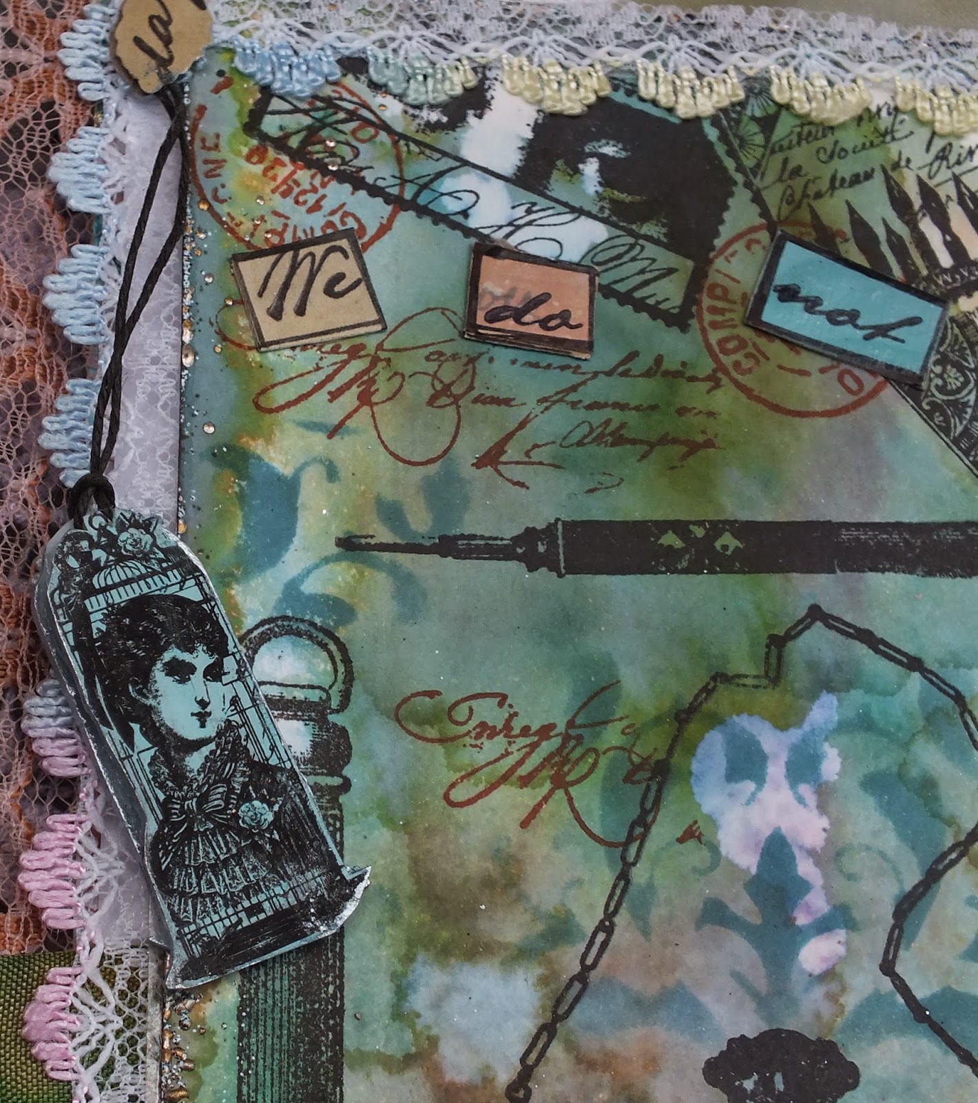
I believe that it was Clara Bow, the silent movie actress who was the original 'IT Girl'. The film in which she rose to fame was just called that 'It'! It was about a feisty shop-girl who possessed that certain something that set her apart - extrovert, fun-loving, charismatic and effervescent, she epitomized the exuberance and freedom that women could begin to enjoy in the 'roaring twenties'. I think the lady at the top of my tag bears a striking resemblance to Clara!
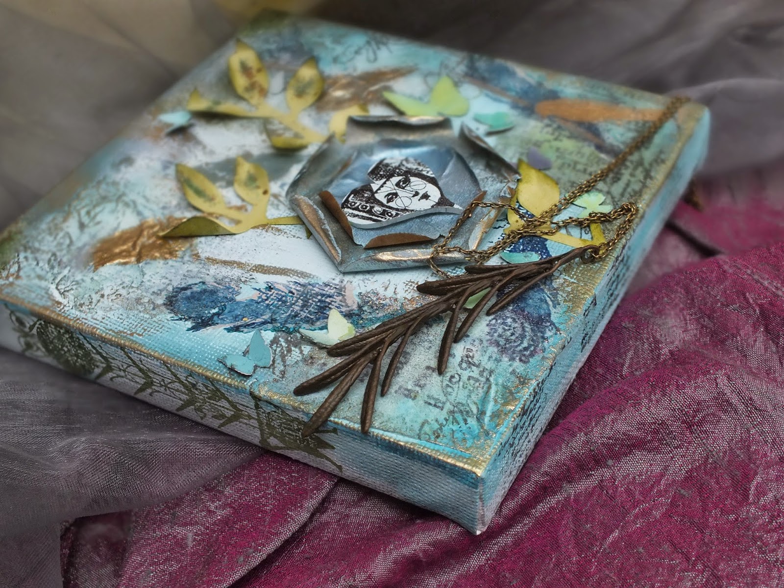
My background for this tag was a blend of PaperArtsy Fresco blues: Lake Wanaka, Antarctic, Mermaid, South Pacific and Inky Pool. The stencils are a Rebekah Meir doily and a Prima Flourish. I used some Chocolate Pudding on the doily and used Leandra Franich's 'bumping' technique to create an impression of 3D. Although an It girl is vivacious she is also very feminine! I stamped these beautiful Crafty Individuals 'Super Stars' of the Silent Screen onto tissue in Onyx Black Versafine painted with a little Stone Fresco and touches of Claret and then stuck them onto the tag with Matte Medium. I then used the masking technique to 'wind' the lacy stamp images across the tag. In places the lace took flight and fluttered into the form of social butterflies - thanks to a Martha Stewart punch! I used some script from a PaperArtsy stamp in a variety of Wendy Vecchi Archivals: Cobalt, Potting Shed and Forget-me-not to suggest celebrity autographs! Clara Bow was probably one of the first movie stars to ensure that a film would be a huge box-office success and she received sack-loads of fan mail!
I covered some pearls with Sapphire Treasure Gold, which gave them a silvery blue tinge for these ladies from the Silver Screen! Two little wooden letters were painted with PA Antarctic and given their own mini butterfly.
I stamped another of the pretty lacy CI designs onto blue Fresco painted card in Potting Soil Archival and combined this with real tea-stained and slightly blue tinted lace. This is something I once saw on the wonderful Lynne Moncrief's 'Adorn' blog! It is probably what inspired me to buy this Crafty Individuals Lace set in the first place! By the time my 'It Girls' tag was complete, edged with some Little Black Dress Fresco and a touch of Sapphire Treasure Gold, my problems seemed far away! I should like to link this tag to the Crafty Individuals June Challenge 'Tag You're It' here. Thank you so much for stopping by and taking a peek into Magpieheaven today! May your skies be blue and your days full of fun and joy!